Round Bit: A Pixel-Perfect Display Font for Digital Design
As a UI designer who ships landing pages, SaaS dashboards, and conversion-focused web experiences, I reach for display fonts like Round Bit when I need immediate tone, texture, and intention—not just decoration. It’s not a workhorse body font, and it shouldn’t be. Round Bit is a deliberate choice: a crisp, evenly spaced pixel display font built with retro game aesthetics in mind—but engineered for modern web use.
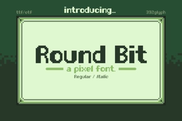
Visually, Round Bit features monospaced proportions, clean 8-bit geometry, and consistent stroke weight across all glyphs. There are no flourishes or optical corrections—just confident, readable shapes that hold up at scale. That consistency matters: on a hero banner at 48px, it reads instantly. At 24px over a gradient background, it stays legible without blurring or aliasing. And because its x-height is generous and spacing is open, it avoids the cramped fatigue common in lower-resolution display fonts.
In practice, Round Bit shines where hierarchy meets personality. Use it for primary headlines on product landing pages—especially for indie games, creative tools, or digital courses targeting developers and designers. Its nostalgic energy builds instant rapport, but its precision keeps it feeling intentional, not gimmicky. On an online store banner promoting limited-edition merch, Round Bit adds memorability without sacrificing scannability. For a portfolio site’s project titles, it gives each case study a distinct, curated voice—like a visual “tag” before the user even scrolls.
It’s also highly effective in conversion-critical zones. Try Round Bit for CTA buttons on a minimalist coaching website: “Start Your Build” in Round Bit paired with a neutral sans serif body font creates clear visual contrast and subtle thematic warmth. Or use it for section headers in a course sales page (“What You’ll Unlock”, “Your First Pixel Project”)—short phrases where tone and pacing matter more than paragraph flow.
Readability on mobile? Solid—when used appropriately. Stick to sizes ≥20px for headings on small screens, and avoid tight line heights (<1.2) in responsive CSS. On dark mode interfaces, Round Bit performs especially well: its defined edges pop against deep backgrounds without glare. Over image overlays, add a subtle text shadow (1px black at 60% opacity) for guaranteed contrast—no heavy outlines needed.
Pairing is where Round Bit becomes truly versatile. Combine it with a clean, highly legible sans serif like Inter, Manrope, or even system fonts (San Francisco, Segoe UI) for body copy and interface labels. That pairing delivers rhythm: Round Bit sets the mood; the sans serif handles clarity and function. For editorial or brand-forward sites—say, a design blog or creative agency site—you can even pair it with a restrained serif like Literata or Lora for subheads, creating a layered, humanist-digital hybrid identity.
Round Bit belongs in the Display category—and it behaves like one. It’s not meant for navigation menus, form fields, or paragraph text. But within its lane—as a headline, logo lockup, badge, banner tagline, or decorative accent—it delivers strong, scalable impact. Think of it as your typographic “hero asset”: deployed sparingly, consistently, and with purpose across your digital touchpoints.
Licensing is straightforward: Round Bit is a commercial font, meaning you’ll need a web license for live sites, client projects, SaaS platforms, or any public-facing digital product. Most vendors offer tiered plans covering domains, pageviews, or unlimited usage—so verify coverage for your use case (e.g., an e-commerce site with 50k monthly visitors needs different licensing than a single-landing-page campaign). Always embed via @font-face with WOFF2 support and include fallbacks—never rely on system fonts for Round Bit’s unique character.
For branding consistency, use Round Bit across your digital ecosystem—not just websites, but social media banners, email headers, and digital ad creatives. When your Shopify store’s homepage banner, Notion brand kit, and Twitter header all share the same pixel-perfect rhythm, users begin to recognize your voice before they read a word. That’s not nostalgia—it’s strategic typography.
It’s worth noting what Round Bit doesn’t do—and why that’s a strength. It doesn’t try to be a variable font. It doesn’t include dozens of weights or stylistic alternates. What it does offer is reliability: one well-hinted, web-optimized weight (often Regular or Bold), full Latin character support, and clean OpenType formatting. If your project requires multilingual expansion beyond Western European languages, check the vendor’s glyph coverage—but for English-first digital products, it’s production-ready out of the box.
In real-world layouts, Round Bit helps solve three quiet but critical design problems: tone alignment, visual breathing room, and brand recall. A fintech dashboard wouldn’t use it—but a browser-based pixel art editor absolutely should. A boutique skincare site might skip it, but a synthwave-themed music newsletter leans in hard. The font doesn’t impose personality; it amplifies what’s already there.
Finally, consider how Round Bit fits into your broader design assets. If you’re building a brand kit for a client, include usage guidelines: recommended sizes, spacing rules, approved pairings, and prohibited contexts (e.g., “Do not use below 18px on mobile”, “Do not pair with other display fonts”). That kind of specificity turns a cool font into a functional, maintainable part of a digital identity—not just a one-off flourish.
Round Bit isn’t about turning every site into an arcade cabinet. It’s about giving digital products a distinctive, trustworthy voice—one that feels both handmade and technically sound. In an ecosystem saturated with generic sans serifs, choosing a purpose-built display font like Round Bit is a small decision with outsized impact on how users perceive, remember, and engage with your work.