Linus: A Display Font That Elevates Digital Branding
It started with a hero section—just a clean image banner, a subtle gradient overlay, and the need for a headline that didn’t shout, but spoke. I’d been cycling through safe sans serifs, but nothing felt distinct enough for a boutique coaching site I was refining. Then I loaded Linus, typed “Clarity Begins Here,” and paused. Not because it looked flashy—but because it felt intentional. Elegant without being fussy, modern without losing warmth, and just structured enough to hold its own against imagery or white space. That’s when I knew Linus wasn’t just another display font—it was a quiet upgrade to how digital brands communicate.
What Linus Brings to Web Layouts
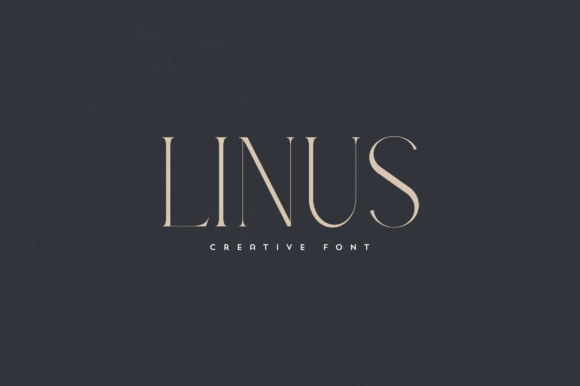
Linus lives firmly in the display font category—and that’s its strength. It’s not built for paragraphs or navigation menus. It’s designed for moments of emphasis: hero titles, section headers, call-to-action buttons, logo lockups, and branded graphics. Visually, it balances gentle contrast with refined letterforms—slight tapering on stems, soft curves on terminals, and an open, airy rhythm that breathes well on screen. It’s neither ultra-thin nor overly bold, landing comfortably in the “premium font” sweet spot: distinctive enough to reinforce brand identity, yet legible enough to earn trust at first glance.
I tested Linus across real scenarios: a product landing page with dark-mode support, a portfolio homepage with parallax scroll, and a course sales page where hierarchy had to guide users toward enrollment. In each, Linus performed best at sizes 32px and up on desktop, and 28px+ on mobile—especially when paired with generous line-height and letter-spacing. Its x-height is generous, which helps maintain clarity on smaller viewports, and its spacing feels intentional—not cramped, not sprawling.
Where Linus Shines (and Where It Doesn’t)
Linus excels where visual impact meets brevity. Think:
- Hero headlines over image banners—its elegance lifts tone without competing visually
- Section dividers like “Our Approach” or “Client Stories”—adding texture without clutter
- CTA buttons (“Start Your Journey”, “Download the Guide”)—when used sparingly, it adds polish
- Logo text for creative studios, wellness brands, or editorial sites seeking refined recognition
- Digital brand kits—as the primary display typeface alongside supporting fonts
But let’s be practical: Linus isn’t meant for body copy, form labels, or dense dashboard interfaces. Its decorative charm fades at small sizes—below 18px, details like subtle swashes or fine strokes soften or disappear on lower-DPI screens. It’s also not ideal for high-contrast accessibility needs without careful testing; while it passes basic WCAG contrast checks at headline sizes, pairing it with a highly legible sans serif (like Inter, Poppins, or even system fonts) for supporting text is essential.
Pairing Linus Thoughtfully
Linus thrives in contrast. On every project, I paired it with a clean, neutral sans serif for body text and UI elements—Inter for its excellent readability and variable weight support, or Montserrat for tighter layouts. The combination creates immediate visual hierarchy: Linus sets the tone, the sans serif delivers clarity. For more editorial or lifestyle sites, I experimented with a restrained serif like Lora or Playfair Display for subheads—Linus handled those pairings gracefully, never clashing, always complementing.
What surprised me was how well Linus worked with subtle animations. A gentle fade-in on scroll, or a slight scale-up on hover for buttons, felt natural—not gimmicky—because the font’s structure supports motion without sacrificing stability. It’s a detail that matters when building cohesive, human-centered experiences.
Technical Notes for Real Projects
Before dropping Linus into production, I checked what came in the package: multiple weights (Light, Regular, Medium, Bold), true italics (not slanted), OpenType features including ligatures and stylistic alternates, and robust multilingual support covering Latin-based languages. Crucially, the webfont files were optimized—WOFF2 included—and loaded smoothly via self-hosting (no external dependencies). Licensing was clear: commercial use covered for client sites, SaaS dashboards, and online stores—as long as it’s not redistributed as part of a template marketplace bundle without permission.
For responsive behavior, I used @media queries to adjust tracking and weight selectively—Linus Medium held up better than Bold on narrow mobile viewports, and Light added delicate contrast for secondary headings without overwhelming. And yes—I tested it over both light and dark backgrounds. With proper contrast ratios and subtle text shadows where needed (especially on image overlays), Linus maintained elegance without sacrificing legibility.
Making Linus Work for Your Brand
If you’re designing a boutique online store, a therapist’s website, a creative agency portfolio, or a digital course platform, Linus offers something rare: distinction without distraction. It doesn’t try to be everything—it knows its role. That makes it incredibly reliable in practice. You won’t spend hours tweaking kerning to fix awkward letter combinations (though Linus includes smart ligatures for common pairs like “fi” or “fl”). You won’t second-guess whether it conveys professionalism (it does) or approachability (it does). What you’ll get instead is consistency—across devices, contexts, and content types—that quietly reinforces your brand’s voice.
It’s the kind of typeface that reminds you typography isn’t just about letters—it’s about mood, memory, and meaning. And in a digital landscape full of sameness, Linus is a thoughtful, human-centered choice—one that earns attention not by shouting, but by standing still, beautifully.